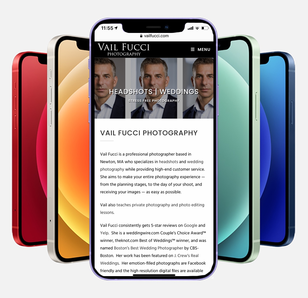
LOOK AT YOUR SITE ON YOUR PHONE AND YOUR COMPUTER, BUT MOSTLY YOUR PHONE
First and foremost you need to design for mobile AND desktop users. Most of your traffic comes from mobile users these days. So while you will be designing your site on a computer, every step of the way you need to check how it looks on a phone.
LOAD SPEED
Next is load speed. You don’t need oodles of bells and whistles on your site. Clear clean layouts that load quickly are important. Going with the cheapest web hosting often gets you slower load times. The theme you pick and the plug-ins you use will have a direct impact on load times. If you are using WordPress for your site choosing hosting with a WordPress specific plan may help you get faster load times as the servers are configured specifically for WordPress use.
ABOVE THE FOLD ABOVE ALL ELSE
The first view that people see on your site is THE most important. This real estate is the most valuable space on your whole site. The term for this space is “above the fold”. It is the content people see before having to scroll down. Most people waste this space with their logo appearing huge on mobile views instead of nice and small. Clients don’t care about your logo. They care about your images. You are a photographer after all. Your product is your images not your logo.
The first load of your page with no scrolling should have your absolute strongest image(s) that will grab them and make them want to see more. Do not have tons of photos on this main page. Just your strongest ones. If you have too many images on your home page it will slow down your load time. Have the images optimized so that when you upload them they are no more than 2000 pixels on the longest side and no more than 300kb when possible. The smaller you can get the file size and still have the image look good the better for load time. Check downsized images for banding in the background particularly with gray backgrounds. If banding occurs you may need to use a larger file size on the image. If you have a carousel of images, limit it to no more than 10.
Don’t have watermarks on these images, or on any of the images on your website. People are already there on your site and assume you took those photos. The watermarks will just be a distraction and no longer serve the purpose of protecting your images from theft as people can erase them in photoshop.
Assuming your website is mobile responsive, IT ABSOLUTELY SHOULD BE, make sure all the images look good when viewed on a phone in a traditional portrait orientation instead of on a desktop. Many of the defaults in responsive web themes are that home page images are cropped when viewed on a mobile phone. This can lead your images to look completely different than you think they will when designing it and viewing it on a computer screen. You can’t count on people turning their phones to the side to see the images in the proper orientation. They will just assume you cropped the image that way intentionally. If the images you have are getting cropped in unflattering ways you may be able to change the settings on your back end, you may need a plug-in, or you may just want to select different images that when cropped on a mobile phone look ok.
If you have text that comes over the images make sure it doesn’t fall in a location that obscures your subject in a strange way, like a word mustache.

Be sure to review how the text looks on mobile and on a computer as it will often fall in different locations on your image. Also check that they don’t strangely hyphenate or just separate mid word to the next line when viewed on mobile.
MAKE SURE YOU DESIGN FOR PEOPLE AND BOTS
You have probably read that to get on the front page of a Google search you need to have the right keywords on your site. That is definitely true. But those keywords need to be placed naturally on the site in such a way that when people, and not just bots, visit your site it makes logical sense that those keywords are there in your content. It needs to be readable and provide the type of information that people are actually looking for. But you also need to have keywords like the city your studio is in, the type of photography you do, and the cities you service regularly. Like for example my studio is in Newton, but I service the Boston area, so I mention both on my homepage. If possible bold those city names or have them in headings as it makes it stand out to SEO bots. Do not just load it up with keywords and say the name of your city and the word headshots, or wedding photography over and over again. It needs to flow like natural language should.
PORTFOLIO
Only have your very best stuff on there. I can’t stress this enough. It’s better to only show 5 killer images than to have 10 images with the 5 killer ones in your portfolio mixed in with 5 mediocre ones.
If your site covers more than one genre of photography make a portfolio page for each genre separately. Only show what you want to shoot. For example I am willing to shoot real estate but I don’t list it on my website directly through the menus because it isn’t what I want to concentrate on. But I still have a page made up of my real estate portfolio and pricing that doesn’t have a link on my website menu. That way I can send out the direct link when someone asks if I could do real estate shots for them without diluting my main branding of headshots on my website.
ONLINE BOOKING SYSTEM INTEGRATION
Get an online booking system that can be embedded directly into your website. I am a big fan of 17 hats. I am able to take credit card payments directly through it making it that much easier for people to book me. Do everything you can to make booking for your client as easy as possible.
TELL THEM ABOUT THE EXPERIENCE
Include information about the experience and the process. For example, tell them when and how people will get their images, how you help them get authentic expressions, what makes you different from every other photographer out there. Write about what THEY get out of the session. Keep this brief and to the point. Your potential clients don’t want to read a book about you.
ABOUT ME SECTION
You don’t have to have one of these sections, but if you do have one, keep it relatively brief. Think of the pertinent information the client might want to know about you. If you have a photo of yourself on your site it should be of the same quality (and ideally style) that you shoot your clients with.
DESIGN FOR BOTH TYPES OF VIEWER: INFINITE SCROLLER AND MENU LOVERS
There are two types of viewers of your website. Infinite scrollers and people who prefer menus. You can set up your site to accommodate both types. For your home page have a few images and key text above the fold. Also have a hamburger menu on your mobile site and a menu across the top for computer viewers. Then have a little bit of information about your business that includes the city you work in and cities you service and what you specialize in. This is where those keywords should come in. Think of it as your elevator pitch. Then have a tiny bit on pricing with a link to a page on your site with more info on that (be it your actual pricing or an opt-in scenario where they have to give you their name and phone number and email to see pricing). Have a book now button, and have a page devoted to booking that is linked to in your menu. Have a contact me button that allows them to email you through a contact form or directly links to your email address, and have a contact me page with that form or your email that is linked to through your menu.
Have a few quick reviews listed. Have a link from those reviews to a page that is dedicated to reviews that have more in depth reviews. Place a link to reviews on your menu.
Between these sections have a few more images throughout but not so many that it slows down your load time.
Remember, then have separate pages that cover the same information in a bit greater detail: a contact page, a page on the experience, a page for portfolio, a page of reviews with links to the pages where the reviews actually were collected, a page dedicated to booking, and a page for pricing. Always have your menu link to those additional pages. If your menu starts to get too bulky, use nested categories with drop downs in the menu, like you could have an about tab, and under that is pricing, booking, reviews, experience. SEO bots like the separate page model of showing info. No matter what the content is on each of these pages, have a book me button and/or contact me button on each of these pages at the bottom so you give them every opportunity possible to easily contact or book you.
Make sure your menu and hamburger menu is easily readable with short choices, like “headshots” not “headshot photography”.
Click on every link on your menu and website yourself on both a computer and on your phone to check that all the links aren’t broken and go to where they should go.
PRICING
Have your pricing laid out clearly with what is included or have opt-in pricing setup where people can easily enter information to have pricing emailed to them or that once they enter their info instantly gives them access to your pricing page.
BLOG
Only have a blog if you are going to have more than just a few posts. If it is only like 3 posts you have just make them as pages instead. When people click on a blog they expect to see many posts and something fairly recent. It doesn’t reflect well on you when your last post was in 2015. Search engine bots love blogs. So having one, even if it is just a few pictures and a few sentences about the shoot can be a great thing to have.
DON’T USE TOO MANY FONTS, AND BE CONSISTENT
When you are creating your website you are presented with hundreds of fonts to use for the headings and text and titles. Resist the urge to use every font in the book. Stick to one or two. Change it up by making your headings be different sizes, or bold face them, or make them all caps, or underline them, or change the character spacing instead of picking totally different fonts. Once you decide how you want them to look, be consistent with them throughout your website.
LOOK AT SITES OF PHOTOGRAPHERS YOU ADMIRE
An additional source of information on formatting can come from looking at the websites of other photographers you admire. Get an idea of the types of information they provide. Be sure to NEVER copy the exact text that another photographer uses though. They likely worked very hard to craft to get the right wording for their website and it would be inappropriate to copy what they have written word for word without permission.
DOES THE WEBSITE ANSWER YOUR POTENTIAL CLIENT’S QUESTIONS?
At the end of the day when you look at your website you need to look at it pretending you are a prospective client. Does it answer all the questions they likely have when looking for a photographer? Does it show them your best work that is representative of what you could do for them?
HAVE OTHER PEOPLE REVIEW YOUR SITE FOR YOU
Once you feel you have done all these things, now show it to several other people. Have them proof read it. Typos gives off an unprofessional vibe. Ask them to be brutally honest. Ask them if there is anything that seems to be missing or anything they didn’t feel needed to be there. Ideally ask people who have backgrounds most similar to your target audience, not necessarily other photographers. If your target client is actors ask a friend who is/was an actor. If it’s doctors ask a friend who is a doctor. The list goes on and on. Because in the end what this site is for is to get you work. If it doesn’t accomplish that goal then it is not of use to you.
I hope you found this helpful!
Awesome stuff, Vail! Thanks for taking the time to put this together. You’re an asset to the Crew!
Lots of great information here Vail, thanks,